CASE STUDY · UI DESIGN
Corporate Website Redesign

Móvil Multimedia is a Costa Rican digital agency founded in 2005, specialized in turning business needs into profitable digital solutions: web and mobile development, strategic marketing, and transactional and health platforms. With over 20 years supporting clients across Latin America and Europe, their edge lies in transforming complex challenges into intuitive, results-driven products.
My rol
UI Designer Jr
Tools
Figma · HTML/CSS
Type
Web Enterprise
PROBLEM
El sitio no estaba convirtiendo visitantes en prospectos
The existing site wasn't converting visitors into leads. The sales team needed a digital tool to support their pipeline: a site that clearly communicated the value proposition and generated qualified contacts.
GOAL
Convertir el sitio en un canal activo de captación
Turn the website into an active lead-generation channel. Design an experience that guided every visitor toward a contact form, giving the sales team a pipeline of real prospects with service-level context.

Target User
Manager or director at a mid-sized company in Latin America, aged 35–55, looking for a trusted technology partner to digitize their processes. Not technically savvy, but evaluates credibility, track record, and service clarity before scheduling a call. Arrives via referral or direct search.
Stakeholder Findings
The contact form had to qualify leads, not just collect names and emails.
The visual redesign was as critical as the content architecture.

Gorilla · Costa Rica
Homepage anchored around a strong portfolio. Case studies as the primary hook.

Pragma · Colombia
Strong service hierarchy with icon-led sections. Visitors scan before they read.

Imaginamos · Colombia
Dense navigation with competing CTAs. Too many choices create decision paralysis.
Design Objective
The project's north star was clear: design an experience that guided every visitor toward a contact form, enabling the sales team to build a database of real, pre-qualified leads.
"Every section of the site had to serve a purpose: inform the visitor, then guide them to the next step."
Design Process
The four-stage structure is sound. The problem is that it describes what you did but doesn't explain why you made the decisions you did.
1
User Flow &
arquitectura
I mapped the user journey together with the team. Each section was designed with a clear purpose: move the visitor toward the contact form. The header and homepage act as the two main entry points, but every path ends in the same place.
View User Flow in Figma:
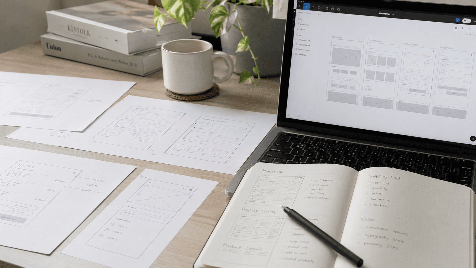
2
Wireframes &
estructura
With the flow defined, I built wireframes focused on scannability. The homepage had to answer a visitor's key questions in seconds: What does this company do? Can I trust them? How do I reach them?
Every content block was challenged: if it doesn't help the user decide, it doesn't belong on the page.
View Wireframes in Figma:
3
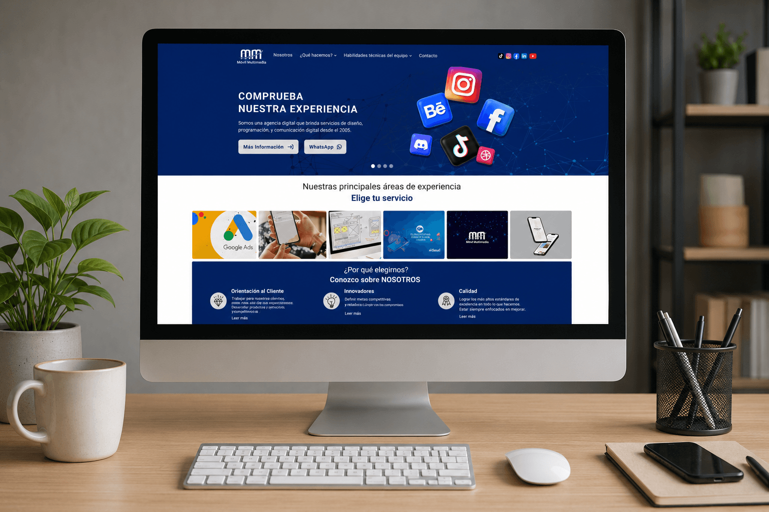
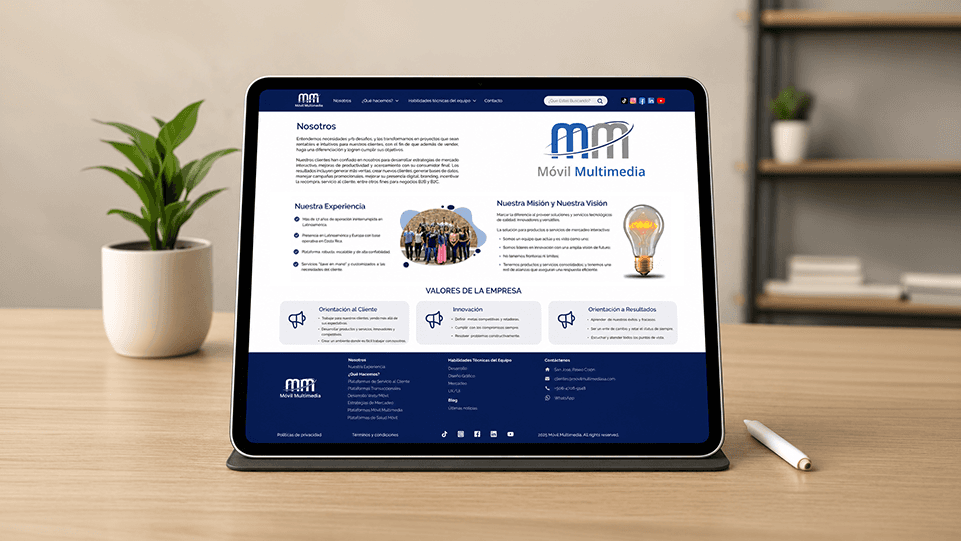
UI Visual &
propuesta final
The visual design translated the corporate identity into a modern, trustworthy interface. The first full batch was delivered: Homepage, About Us, and Contact Form, each across three breakpoints (desktop, tablet, and mobile) to ensure a consistent experience on any device.
View Final Design in Figma:
4
Dev Handoff &
especificaciones
Design work doesn't end at the visual deliverable. I prepared a detailed handoff for the development team with precise specifications for every component: behaviors, spacing, interaction logic, and states. The goal was for developers to build with confidence no guesswork.
View Handoff in Figma:


SUCCESS KPIs

Form submissions +30%
Direct conversion increase
Avg. time on page
+45s
Content hierarchy retains attention
Bounce rate
-15%
User flow reduces first-contact drop-off
Browse the complete Figma file directly: wireframes, design system, high-fidelity screens, and UX decision annotations — all documented to demonstrate tool proficiency and design thinking.
Conclusions
This project taught me to design with a concrete business objective as my north star. Every design decision — from visual hierarchy to form placement — was grounded in a real need from the sales team. I also came to understand the value of a well-documented handoff not as a final step, but as an integral part of the design process itself
Related Articles


Stay in touch
If you'd like to know about my work and projects, send me an email.
